▼
Advanced Options
?
Sort by:


popularity
similarity
?
Must Include:
?
Cannot Include:
?
Look For
▼
Sponsored Links
You're looking for other sites like :
 |
Daytum is a home for collecting and communicating your daily data. ... Daytum is free to use for as long as you like, but we also offer a Daytum Plus account ...
http://daytum.com/about/features
popularity:
statistics
data
tracking
visualization
design
tools
chart
applications
inspiration
infographics
|
new
search by a custom tag signature
 |
WallStats.com is reborn! Banned from Digg.com. The Fall of GM - a visual guide © 2009 Wallstats.com and Jess Bachman. All Rights Reserved. ...
similarity:
popularity:
visualization
statistics
design
information
politics
art
posters
reference
data
infographics
|
 |
The biggest problems, for me, are the obtrusive frames and tick marks, ... To improve this, I deleted the axes, greyed out the tick marks, shrunk the graph ...
similarity:
popularity:
visualization
design
statistics
data
blog
infographics
graphics
science
information
numbers
|
 |
Please enable JavaScript to use Data360.org. Please follow the steps below to enable JavaScript. First determine what browser version is in use: ...
similarity:
popularity:
data
visualization
statistics
web2.0
research
reference
graphics
graph
social
tools
|
 |
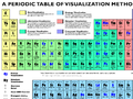
By presenting information in a compact and creative approach, infographics are able to quickly convey knowledge and engage its viewers. ...
similarity:
popularity:
infographics
design
visualization
inspiration
graphics
information
illustration
infographic
data
statistics
|
 |
Timetric makes data useful by storing, searching, graphing and publishing the world's statistical data
similarity:
popularity:
visualization
statistics
data
tools
charts
graph
api
timeseries
analytics
web
|
|
|
No information avaiable
similarity:
popularity:
visualization
charts
statistics
chart
reference
design
presentation
tips
data
graphs
|
|
|
If the world were a village of 100 people, how would the composition be? ... The numbers are turned into graphics to give another sense a touch – Look, this ...
similarity:
popularity:
design
visualization
statistics
graphics
world
posters
inspiration
politics
infographics
art
|
 |
Within minutes, our free data visualization tool can help you create an interactive viz ... Anyone can do it, it's that easy—and it's free. learn more ...
similarity:
popularity:
visualization
data
tools
graphics
charts
infographics
design
free
software
analytics
|
 |
No information avaiable
similarity:
popularity:
visualization
design
reference
information
data
graphs
tools
presentation
table
graphics
|
|
|
TRACK ...
similarity:
popularity:
design
inspiration
visualization
statistics
marketing
branding
cool
flash
fun
sprint
|
Sorting Results
- This slider determines how the matched sites are sorted.
- If you want to see the most popular sites that are somewhat related to your search, slide this more towards "popularity."
- If you want to see the sites that best matched your search, regardless of popularity, slide this towards "similarity."
Must Include Tags
- Matched sites will not be shown unless they have all of the tags on this list.
- This feature is useful for when you require a site to have been tagged as something.
- To add a tag to this list, click "add tag" or click on any tag in a result.
Must Not Include Tags
- Matched sites that have any tag on this list will not be shown.
- This feature is useful for filtering out results that have tags you are absolutely not interested in.
- To add a tag to this list, click "add tag" or click on any tag in a result.
Types of Results
- This option lets you specify the types of sites to show.
- If you want to only see domains (www.
.com), select "domains only." - If you want to only see articles (www.
.com/something/here), select "articles only." - If you don't care, or care so much about both, select "Both".
About The Results
 an example search result
How moreofit Searches
Each website has a unique tag signature -- a set of words
that users have described the website as. Moreofit searches
for websites that have similar tag signatures and displays the results.
1: Similarity
A site's "similarity" is determined by how well its tag signature matches the tag
signature that is being searched for. A 100% match means that it has the exact same
tags in the exact same order, while a 0% match means it has no tags in common.
2: Popularity
The popularity of a website is, well, pretty much self explanatory.
3: Tag Signature
The tag signatures show how a site is described. The deeper the color of the tag,
the more frequently the website is tagged as this. Tags underlined blue denote a tag
that is in common with the search's tag signature.